The Time I Couldn't Read My Own Dashboard
I built an internal dashboard for a client once. Gray text on slightly lighter gray backgrounds. It looked sleek in my design tool. Then I tried to use it in a meeting room with bright overhead lights and couldn't read half the numbers. My client, who had aging eyesight, couldn't read most of it. That was my introduction to why contrast matters in practice.
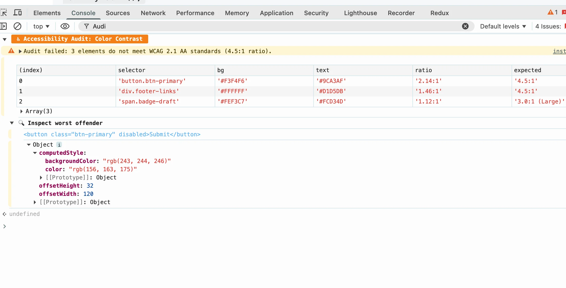
Poor color contrast makes websites unusable for millions of people. Not just those with diagnosed vision problems—anyone viewing in bright sunlight, on a cheap monitor, or with temporary eye strain. WCAG (Web Content Accessibility Guidelines) specifies minimum contrast ratios: 4.5:1 for normal text at WCAG AA level, 7:1 for AAA. These numbers aren't arbitrary—they're based on research about what contrast levels people with low vision can actually read.
The thing that surprised me: buttons and focus indicators need good contrast too. Everyone focuses on body text contrast and forgets that interactive elements are equally important. If someone can't see that a button exists or where the focus is, the form is broken for them.
Understanding WCAG Contrast Ratios
Contrast ratio is calculated from the relative luminance of the foreground and background colors. A ratio of 4.5:1 means the lighter color is 4.5 times brighter than the darker one. Black text on white background achieves roughly 21:1—the maximum ratio.
WCAG has two conformance levels:
- AA (minimum): 4.5:1 for small text (under 18pt regular or 14pt bold), 3:1 for large text (18pt+ regular or 14pt+ bold)
- AAA (enhanced): 7:1 for small text, 4.5:1 for large text
Most projects target AA as the minimum. AAA is nice to have but not always achievable with design constraints. The tool I built lets you check both levels instantly.
Color Blindness: More Common Than You'd Think
About 8% of men have some form of color vision deficiency. Red-green color blindness (deuteranopia/protanopia) is most common. Blue-yellow (tritanopia) is rarer. The tricky part: most people with color blindness don't know they have it until they're tested. Your users might be struggling with your design and you won't know.
Never rely on color alone to convey information. This is the biggest accessibility mistake I see. Error states that are only red, status indicators that only differ by color, required fields marked only with color—all of these fail for color-blind users. Always add text labels, icons, or patterns in addition to color.
I added a color blindness simulator to the tool. It shows how your color combinations appear under different types of color vision deficiency. It's not perfect (every person sees differently) but it catches the obvious problems.
Building Accessible Color Systems
The easiest approach: start with dark text on light backgrounds. This gives you the highest contrast ratios naturally. Light pastel text on white backgrounds is almost always problematic.
If you need a dark mode, don't just invert your light mode. Dark backgrounds need lighter text, but the ratios work differently at lower luminance levels. Pure black (#000000) on pure white (#FFFFFF) gives 21:1. But dark gray (#333333) on black (#000000) gives only about 9:1. The math doesn't scale linearly.
Build a limited color palette with tested contrast ratios. Don't let designers pick colors ad-hoc and then try to fix contrast later. It's much easier to start with accessible colors and adjust from there than to try to make a beautiful palette work.
Test gradients carefully. A gradient that has good contrast at one end might not at the other. If you're using text on gradients, check the contrast at the lightest and darkest points.
Practical Tips I've Learned
- Check early and often.Don't save accessibility testing for the end of a project. It's much harder to fix contrast issues after the design is finalized.
- Test with real tools, not assumptions. The human eye is terrible at estimating contrast ratios. Use a tool that calculates the actual ratio.
- Remember interactive states. Hover, focus, active, and disabled states all need good contrast too.
- Consider environmental factors. What looks fine on your calibrated monitor might be unreadable on a phone in bright sunlight.
- Include disabled states.Disabled buttons are often low contrast by design (to de-emphasize them), but if they're too low contrast, users can't read them at all.
Why This Matters Beyond Compliance
Accessible contrast helps everyone. Older users, users in bright environments, users on cheap monitors, users who are tired—everyone benefits from higher contrast. WCAG guidelines are baseline best practices, not ceiling requirements.
Beyond usability, there are business reasons. Accessibility lawsuits are increasing. Many corporate procurement processes require WCAG compliance. But mostly, I think it's just the right thing to do. Building something that excludes people because you didn't check contrast ratios feels embarrassing in retrospect.
Written by Bai Shuang, a full-stack engineer with 16 years of Java/JavaScript experience, 10 years of Scala, and 8 years specializing in privacy-focused tools.
GitHub: @oldbig. Open source project: redux-lite - A lightweight React state management solution.